Ok, thanks!  I'll either try to add some desperation to this image, in his face and hands, or start something from scratch if I can't manage that.
HM - Q4, vol 28 (
HM - Q1, vol 30

I agree I don't see anything that conveys desperation or fear or peril etc. If you told me it's someone floating tranquilly thru a dreamworld, I'd say "that's a tranquil dream, yeah"
This isn't one of mine, but I googled images for "desperation" and something like this screams desperation to me:

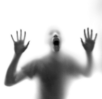
... and even those border upon being "portraits" and would benefit from a desperate context, something that hints at WHY it's a desperate upload (a threatening monster or situation etc)
Just imo though ....
 'The only tyrant we accept in this world is the still voice within.' -Gandhi IOTF:Winner Q1 vol.27 (3x Finalist); WOTF: HM x2
Ok, thanks!
Oh, this is an image you made? Very cool.
I think Soul Mirror pointed out before that the character is looking off screen. What about a screen shot from a different angle, so that the character is looking at us? I know when my spouse makes 3D images he often cheats on setting up just enough of the background for the shot he wants, so I'm not sure if you can rotate with the background you have, just a suggestion.
Oh, this is an image you made? Very cool.
Thanks!
I think Soul Mirror pointed out before that the character is looking off screen. What about a screen shot from a different angle, so that the character is looking at us?
Tried that, but don't really like the result:

It just doesn't look right. (That's also the most desperate expression I could find.)
So, I took a stab at a new image, showing a threat:

And, finally, I did an alternate version with a different colour to his armour:

My only other idea is a space scene, (the story does mostly take place on board a ship), but I'd need to buy some more content for that, so it'll have to wait until I'm paid again.
HM - Q4, vol 28 (
HM - Q1, vol 30
Comparing the images side-by-side at thumbnail size, I think the white armor stands out more than the red.
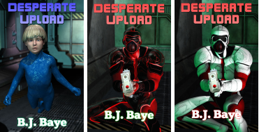
Comparing the images side-by-side at thumbnail size, I think the white armor stands out more than the red.
Thanks! I hadn't even thought to do a thumbnail comparison. So yeah, looks like the white is the best choice.
HM - Q4, vol 28 (
HM - Q1, vol 30
No question that the white version stands out better, so my preference for the red is utterly a personal taste thing. (Me, I gotta "go" with what I feel for, heart before head. If I had a surefire solution, I'd go with that, but knowing it's usually a toss of the dice anyway, if I fall short I don't wanna second-doubt myself! "Heck -- I never liked that anyway" leaves a worse disappointment than "Well ... *I* luv'd it." 
But objectively, yes, the white grabs my eye too, I just liked the red. I liked BOTH the new scary war guys far more than the sedate-boy.
You might even have the boy standing behind the war guy, cringing against the wall to the right, and then there's drama because we're waiting for the war guy to turn around and imperil the kid?
But both the war guys make a cool cover!
'The only tyrant we accept in this world is the still voice within.' -Gandhi IOTF:Winner Q1 vol.27 (3x Finalist); WOTF: HM x2

My first commission! I just wanted to know if anyone felt it was too noisey.
That's pretty awesome! I don't think it's too busy. When I shrink it down to thumbnail size a lot of the ancillary details sort of fade out. I think it looks good. Remember that some platforms will only accept black and white interiors, so it may end up looking like this on someone's eReader:
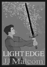
Which is still pretty badass, though I might suggest increasing the contrast between the figure and the background.
Not "too noisy" at all, imo, just very lovely and cool illustration! Luving the variation and visual energy of the fire/sparks/pizzazz dancing around the sword blade!!! 
'The only tyrant we accept in this world is the still voice within.' -Gandhi IOTF:Winner Q1 vol.27 (3x Finalist); WOTF: HM x2
Thank you guys. I did up thecontrast a bit and sent it off for approval. Just constantly looking for the next job!
Hello all you fine WOTFers! I was wondering if I could solicit some input on a mock-up of the cover for my first ever short story in ebook format. I did this in Gimp, using a free stock photo (all I did to it was crop it rather severely).

Is it just too boring? I feel like the description on the cover may be a tad excessive, but something is probably necessary to make sure people don't assume this is a Nicholas Sparks sort of story. I'm not in love with the font, either, and I think the black and white text might be a bit boring. But at the same time, I am going for a somewhat understated feel too (to match the tone, which is pretty deadpan, even when narrating mass casualties). Any thoughts?
Patrick S. McGinnity
Mt. Pleasant/Beaver Island, Michigan
R x 3
Q2 2012 - HM
Look for "The Dubious Apotheosis of Baskin Gough" in the ARCANE II Anthology.
It's striking, and the image sticks out well when reduced to thumbnail size--but what genre is it? As is, it screams 'literary' to me.
~Marina
WotF Winner Q1 2012 (Vol. 29)
WotF Finalist Q2 2010 (Vol. 27)
WotF Finalist Q4 2011 (Vol. 28)
I got the same impression re literary. The cover image definitely evokes the title.
I guess it looking literary isn't deceptive, as far as the plot goes, though it is far closer to Vonnegut than Hemingway. It was sort of inspired by this Donald Barthelme story, "The School" where a class adopts one thing after another (each a progressively more serious commitment), only to have each die from neglect. In the end, they adopt a kid and it gets sort of weird after that. Anyway, "Hard Winter" is not SF in that there is no real speculative element, other than a sort of apocalyptic feeling and an impossible string of disasters. So yeah, it is unrealistic, but also not quite speculative. Thanks for the input, both of you!
Patrick S. McGinnity
Mt. Pleasant/Beaver Island, Michigan
R x 3
Q2 2012 - HM
Look for "The Dubious Apotheosis of Baskin Gough" in the ARCANE II Anthology.
Very dramatic image visually, but i agree it says little about the genre (though the caption does promise comedy).
Have you considered using some sort of "abused" or broken / corroded font for the title? Or breaking the lower caption lines up so it reads differently?
A black comedy about an island the world forgot
and the winter the survivors never will
maybe? "and the winter its survivors never will" ?
But I'm just throwing snowballs of ideas there.
I agree with others it's a cool image. Something "genre" could be hanging from the tree?
'The only tyrant we accept in this world is the still voice within.' -Gandhi IOTF:Winner Q1 vol.27 (3x Finalist); WOTF: HM x2
So yeah, it is unrealistic, but also not quite speculative.
Then I think it looks pretty good. Professional even. And shows up well as a thumbnail. 
Thanks for the feedback, Soulmirror. I'll have to look into a more distressed font for the title, and I like the idea of breaking the description in a different place--I teach poetry sometimes, so I should have thought of that!
Thanks to Strycher and as well AustinDM as well.
Patrick S. McGinnity
Mt. Pleasant/Beaver Island, Michigan
R x 3
Q2 2012 - HM
Look for "The Dubious Apotheosis of Baskin Gough" in the ARCANE II Anthology.
Yeah, 'distressed' was the word I was groping for. 

'The only tyrant we accept in this world is the still voice within.' -Gandhi IOTF:Winner Q1 vol.27 (3x Finalist); WOTF: HM x2

So I've got a couple of covers I've done and was wondering what people thought?
Here is (hopefully) a link to a small version of both (but I've included a link to a large version at the end too)
Here it is ... Cover #1:
And here is ... Cover #2:
Big link to cover 1: http://www.davidkernot.com/wp-content/uploads/2013/05/beam-ridersa2.jpg
Big link to cover 2: http://www.davidkernot.com/wp-content/uploads/2013/04/the-early-years.jpg
For more information on these, see my blog post at: http://www.davidkernot.com/?page_id=958
Very sporadic submitter but 9 HMs: latest Q1 2021
Author of Gateway Through Time: Available at https://www.smashwords.com/books/view/1112672
Well, I luv the second one! Makes me want to know what it's all about: a "buy this book" cover for sure imo!
The first (and it's just my two cents and in hopes of helping a fellow forumite etc) I think doesn't quite gel? The woman is too much a snapshot of an individual (rather than a "character" in a story, and she's too static) and the photorealism there doesn't quite mesh with the more sci-fi fx feel of the background?
But that'd be just my personal taste: I'm sold by #2 and not grabbed by #1 ... and cover art on any book is there to sell the book, period imo.
'The only tyrant we accept in this world is the still voice within.' -Gandhi IOTF:Winner Q1 vol.27 (3x Finalist); WOTF: HM x2
David, when I looked at the first cover I wondered why it says "a story" instead of "a novel" or "a short story"?
Okay guys, whatcha think?:

This is a premade cover, but I can ask for adjustments. I think it looks pretty nifty, but I'm bias and I wonder what others think. (As an aside, it's really hard to find premade covers that might be appropriate for superhero stories.) Thanks in advance!
Strycher,
I think that cover proves how difficult it is. Until I read "A Superhero Story", the mask only confused me. I didn't realize it was a mask, and I wondered what sort of barrier she was looking through.
http://nineandsixtyways.com/
Tools, Not Rules.
Martin L. Shoemaker
3rd Place Q1 V31
"Today I Am Paul", WSFA Small Press Award 2015, Nebula nomination 2015
Today I Am Carey from Baen
The Last Dance (#1 science fiction eBook on Amazon, October 2019) and The Last Campaign from 47North
Yeah. That's actually face paint on the model as far as I can tell. It's hard. I browsed for months looking for a cover or even stock art that I thought would work. There isn't really a market for superheroes in prose ( the Amazon sub genre has just over 1000 entries for superhero) and so I don't think artists/cover designers really work in that area. I don't want to commission original artwork for a short story. (Really I shouldnt be paying for a short story cover at all, but that's a different conversation).
Any way, long-winded way of saying that that's why I asked for the superhero tag right on the cover. I hope if I file it right when I upload it to retailers that all will be clear.
I actually love it. It's very dramatic and has a lot of emotion. I think I knew "superhero" because I totally remember the story. And what? Superheros can't wear face paint?
As far as proportions I think your name can be a smidgen bigger.
Tina
I actually love it. It's very dramatic and has a lot of emotion. I think I knew "superhero" because I totally remember the story. And what? Superheros can't wear face paint?
As far as proportions I think your name can be a smidgen bigger.
Thanks, Tina.
I'm with Tina on the cover, Krystal.
Jeanette Gonzalez
HM x4, SHM x2, F x1
I like it alot! But I actually didn't "see" it as a mask at all, I can see it as "facepaint" ... but really I just thought it was the flame light spot-illuminating the eye.
Even by that interpretation, it's a killer cover imo. But if you want to emphasize the "superhero" aspect, I'd agree that saying it on the cover is best since I myself didn't visually "see" it as a mask etc?
'The only tyrant we accept in this world is the still voice within.' -Gandhi IOTF:Winner Q1 vol.27 (3x Finalist); WOTF: HM x2
Looking for any feedback on this cover below. The swirlies are because the image is not yet licensed. They would go away.
What sort of story vibe does this give you?
Thank you!

Rebecca Birch
Finalist - 2, SF - 1, SHM - 1, HM - 18, R - 6
Words of Birch
Short Story Collection--Life Out of Harmony and Other Tales of Wonder
